Justin from Secret Serpents was kind enough to ask me again to be in on a gig poster tour series for a favorite band of mine, High on Fire. I had a wedding coming up followed by a honeymoon, but Justin said I’d get some date late in December. I thought, hey, no problem. Then he gave me my date… it was before my honeymoon ended. The only way I’d get this poster done was to cram it in-between my blessed matrimony and my drunken adventures in Central America.
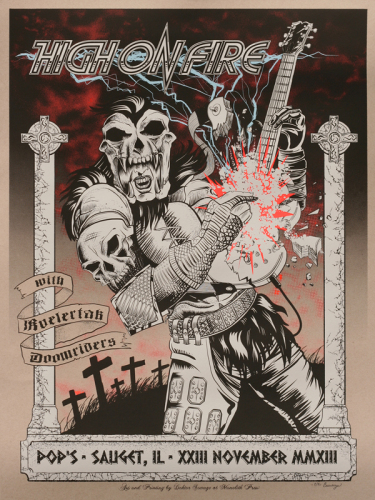
I’m happy with the result. I had maybe my goofiest idea yet for a poster and managed to finish it early and get it shipped off to Matt Pike and the boys to sell at their show. My copies are up for sale here on the site: https://www.doktorsewage.com/product/high-on-fire-2013-11-23/ Time constraints, however, meant that pen never met paper when I drew this poster. I had to get all Tron up in this bitch.
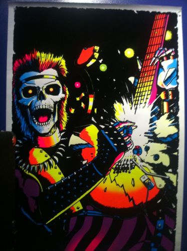
The idea for this poster started when Sean from Impaled picked up a new poster for our rehearsal spot. I remembered John Cobbett (ex-Ludicra) had the same poster in the Ludicra space from back when he was a kid. It was such a ridiculous image, I had to rip it off. I’d say homage, but c’mon… I totally bit this and chewed.
I’d done posters and other artwork exclusively on the computer before. It’s what usually happens when I go, “Oh shit, that’s due WHEN?” It’s because I can do the drawing anywhere, unlike inking with a brush. When there’s my wife’s cats trying to jump in my lap while working at home, I’m assured ink spills. I started my sketch directly in Photoshop.
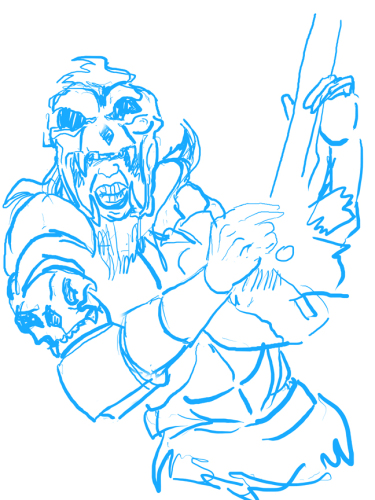
I had been wondering whom to recast as the glam rock skeleton. Zombie? Warrior? Then I thought of the Kurgan from Highlander. His over-the-top barbarian armor fit the High on Fire aesthetic. I’ve also decided to accept nostalgia in my art because no one seems to like anything where I reference actual history, only movies and television pop culture. So really, yer all barbarians in my eyes, you uncouth fucktards.
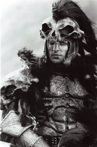
Did you know the Kurgan has an impressive Wikipedia page? I’m always in awe of how nerds can fill out the fictional history of sci-fi and fantasy characters with more detail and accuracy than the biographies of real people. After all my artistic and musical endeavors, I don’t have a Wikipedia page… but the Kurgan does. My grapes are so sour, I’m getting drunk on ’em.
Now, in the past I’ve used Adobe Photoshop or Illustrator to draw. The problems were that Illustrator brushes don’t flow naturally enough and Photoshop brushes don’t flow evenly enough. I looked into it, and the Photoshop problem is because its pixel interpolation isn’t great. What this means is, it reads where you’re painting periodically and fills the in-between. If ya zoom in, it reads the dots close together. Zoomed out, it reads like shit and you get a shaky line. I needed something better.
Sean from Impaled recommended me a program years ago, but I never jumped on it until now. I feel more the fool for it, because Manga Studio is the shit. It runs a lot like Photoshop as far as drawing and the way it organizes tools and layers, but the pixel interpolation is super fine. Lines look as smooth as a real brush stroke. Actually, probably smoother.
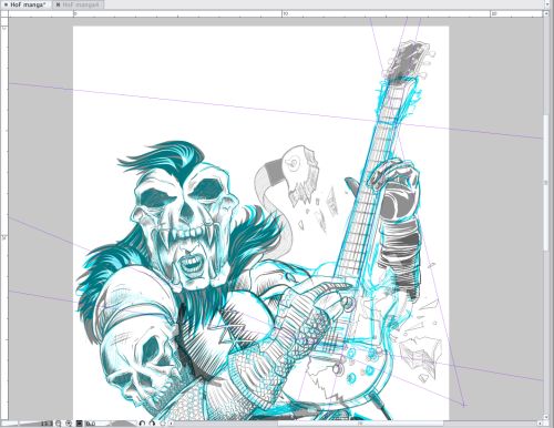
In the screen capture above, you can see some lines around the guitar. This is an awesome tool in Manga Studio that will make me forever swear off Photoshop: perspective rulers. I was able to set up a three-point perspective to get the angles on the guitar looking just right. The program works very intuitively to follow the rulers no matter where the line actually starts.
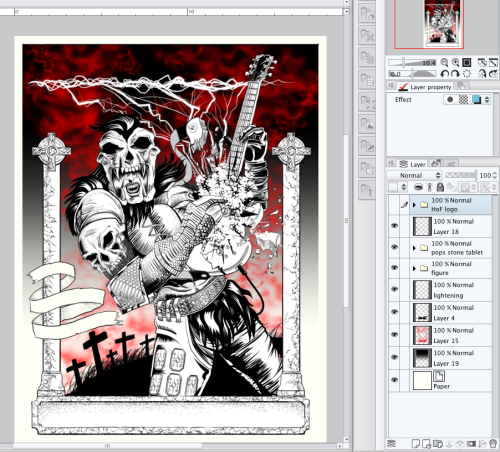
Manga Studio is also great because its layers export seamlessly into Photoshop, which is where I would be doing my color separations. Having all the art still in layers makes that 100 times easier. The only drawback to Manga Studio is that because it’s a more niche program used by less people, there are less resources like extra brush sets available. I did find one good set for sale from a DeviantArt user going by the name of 888toto. I used them in my final piece to add some texture.
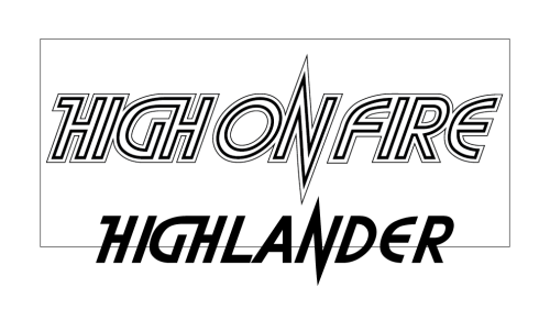
The Highlander logo and the High on Fire name were practically made for each other. I downloaded a Highlander font from some freebie web site and manipulated it in Illustrator and then Manga Studio until I got the metallic-looking one that appears on the poster. I exported it from Illustrator as a .png file to maintain transparency between programs.
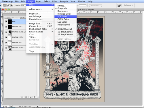
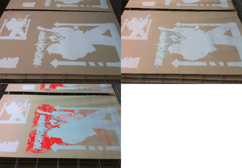
After doing the separations for color and adding trap in the Channels menu of Photoshop, I outputted the seps and printed them at Monolith Press.
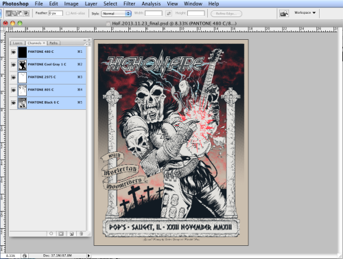
Doing separations in Photoshop channels is a cinch. It’s basically like painting, but only one color shows up depending on what channel you’re using. Or two, if you select two channels. The thing to remember is to use spot channels, because this is how a screen printer will output the separations: not layers.
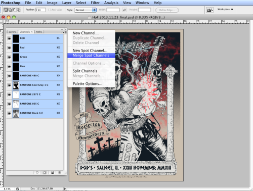
Once you have these spot channel colors, though, your file will no longer save as normal RGB .jpg. If you want to convert your file back to RGB, say, for making a preview for a client, you first have to add a new alpha channel and call it “Grey” or something. Convert that channel back to “Grayscale.”

Once that channel is back to being in Grayscale, then further convert it to RGB.
Now that you have RGB channels again, select ALL the channels and merge them.
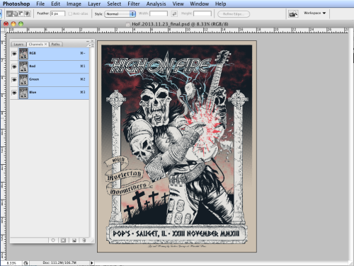
Now you have a file with normal RGB channels that are web safe and can be saved as a .jpg, .gif, or whatever you wanna share through email or online.
The final step is to buy yourself one of these posters and celebrate High on Fire or Highlander, or both. I know I originally said there can be only one, but I managed to squeeze two into this poster.
https://www.doktorsewage.com/product/high-on-fire-2013-11-23/
And I got just one last thing to say; it’s better to burn out than to fade away.

