I’d been planning to do a gig poster for the upcoming Ghoul show / Tankcrimes showcase at world famous punk club 924 Gilman. I was beginning to think it wouldn’t happen what with too much work, the holidays, etc. Well, work slowed down. Instead of sitting around playing with my new Christmas socket wrench set, angle grinder, or digital soldering station, I got to work. I’ve had enough time dicking around with pedals. It was time for some more art!
Strictly speaking, me being able to screen print my own 18×24″ poster is hardly DIY. It’s been my occupation to print posters since my utter failure to make it in the design industry. Nice work if you can get it and my boss is a peach (he hates when I call him boss). It’s still a fair amount of work to carry the project forth from beginning to finish.
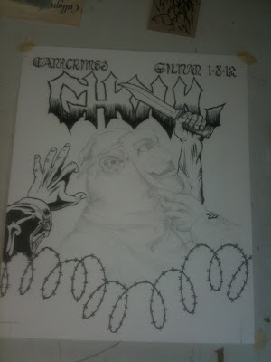
The idea for this poster germinated with lots of online jokes about “shut down Ghoul-man Sachs!” and other Occupy Wall Street related humor surrounding the upcoming gig. Topical political humor is dear to my heart. I consider myself more politically educated than most. Fuck, I podcast Real Time with Bill Maher. I also really liked the idea about a masked madman wearing an Anonymous mask on top of that. Redundancy makes me laugh.
I did the artwork on large bristol board and used a good amount of photo reference to jump off from. The inks were largely done with Higgins Black Magic and a brush, with a few pick up points being done with pen.
For the blood splatters that are needed on any Ghoul drawing to differentiate our hooded anti-heroes from the actual villains in the KKK, I used tracing paper. I masked off areas of the drawing and went forth with the splatter. I planned to import this in later as its own layer and make the color separations much easier on myself.
At my work, Monolith Press, I scanned in the drawing and the splatter. I use Adobe Photoshop to do the separations. Because of the size of the drawing, it had to be scanned in slices. For years I’ve put these slices back together the hard way, using erasers and healing brushes to blur the seams. Nowadays, there’s an easier way.
First, I put the slices fairly close together on separate layers in the same file. The Auto-Align Layers command is brilliant. I select both layers and it puts it all together based on the data from separate layers.
After the layers are aligned, I use Auto Blend Layers and the slices are smoothed out to look like one perfect piece of art. Well, as perfect as it is drawn, anyway. Flatten the image, and you’re ready for the hard work.
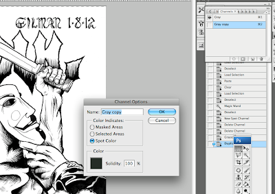
The curves are adjusted to get out the color of the paper and make the blacks bold. This is important for the color separations and moving the drawing into channels. All of this is to make it easier to print out onto film in the end. Using the “adjust curves” menu seems to have better success in preserving the original line quality as opposed to the “levels” or “contrast” functions in Photoshop.
Once the line work is finished being edited, I convert the grayscale channel into a spot color channel. Again, this makes it easier to output the final films for burning onto a screen for printing. Each color is given its own channel. Layers are obsolete after this point.
The final artwork is finished with a brown channel and a red channel. This is going to be a simple two-color print, not only to look punk rock, but also because I don’t have a lot of time or money to do a full color poster. What’s more punk than that?
After a series of file conversions and outputting, the final PDF is created and is ready to print onto a film with our big-assed ink jet printer. We’ve got a special printer profile that makes the film blacks ultra dense for exposure to the light sensitive emulsion that is used on the screens.
I check the films on a light table for all the fuck-ups I assuredly missed during the computer editing. There’s quite a few marks that have to be scratched out with an X-acto knife and black areas that need to be filled in with an opaquing pen.
This is our makeshift exposure unit. Onc vacuum table for the screen and one light that used to be vertical. We strapped it onto a weird Ikea dolly my boss found with some pipe tape. It works smashingly.
A most essential part of the process… a quick shot of grappa with the boss man, Mauz. He most graciously lets me use his shop and all the facilities during non-working hours to lovingly create art for the literally unwashed masses. Also, his band
Kicker is on this poster. I’m sure that greased the wheels a bit… along with the liquor.
The screen is mounted into our Argon auto-press and the ink is poured. I feed the paper manually and onto drying racks after each hit. The Argon is a hydraulic press, so it’s not super noisy like some other auto-presses. It’s quiet nature belies its Italian origins.
While I was busy printing, Mauz was working on knolling his workspace (look it up). He managed to give himself a nasty cut. Never one to miss an opportunity, I had Mauz drip his precious ichor directly into the ink I was printing. KISS, eat yer fucking hearts out. This poster has KICKer blood!
No joke, the cutting machine scares the dickens out of me. Not only could it crush your hands or completely sever your fingers, but you can totally fuck up a job very easily by not being careful before pressing the button. There’s the old adage about measuring twice and cutting once. I’m pretty sure I measure about eight or nine times.
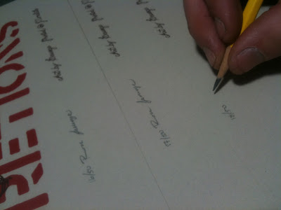
Finally, I hand sign and number all the posters in the edition of 50. My signature looks like shit, but hey, what do you expect out of a doktor? Ever seen a prescription?
And I’m done. Most of these will be delivered to the show for sale to the punks that survive the onslaught of Ghoul. For those unlucky to miss out on the slaughter, I’ll have some up in my
web shop a few days after.
Doktor Ross Sewage
www.doktorsewage.com


Bad and ass. Thanks, as always, for sharing! I have a pretty nifty color sep. action for Photoshop that's just peachy! I would be glad to share! 🙂
the poster looks great, love reading your process as well. will be purchasing one!
Great artwork and a damn interesting read!
Thanks for sharing, it´s cool to see how your magic is done!
Holy shit, had no idea about that "align layers" tool. You've just saved me so much time!