I was contacted by a punk band via myspace about doing a tee shirt design for them. The band, (Order of the) White Rose, is a pretty damn good punk band from Hawaii. Not your usual locale known for anti-establishment rock.
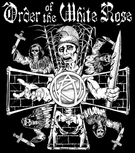
We decided to do a design based on their song “Sky Breakers.” The lyrics are about Christian missionaries coming to Hawaii and “fucking things up for everyone.” That’s usually what Christian missionaries do, if they’re not busy being killed by death squads in Nicaragua. That song was in turn based on a poem by Albert Wendt, called “Inside us the Dead.” I was into it.
I did some reading up online with Wikipedia on Hawaiian history, followed by some pages from “A People’s History of the United States” by Howard Zinn. I already had some notions of the natives being exploited by C&H; Sugar, as well as the bloody history of Captain Cook, and the fact that Hawaii was not even given the proper procedural vote to become a state. They were coerced. I also became familiar with the history of the last monarch, Queen Liliuokalani and how she was forced out by robber barons and how King Kamehameha first united the Islands in an attempt to save them. Who says punk can’t be educational?
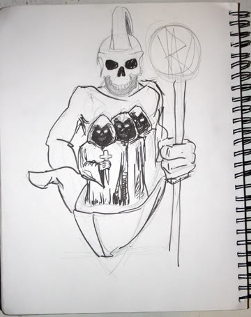
I started with this basic idea of an undead native Hawaiian, drawn in my sketchbook during a Ludicra show. It’s not very good, and Aesop made fun of it and asked if I was taking over for Pushead. I didn’t even bother showing it to the band.
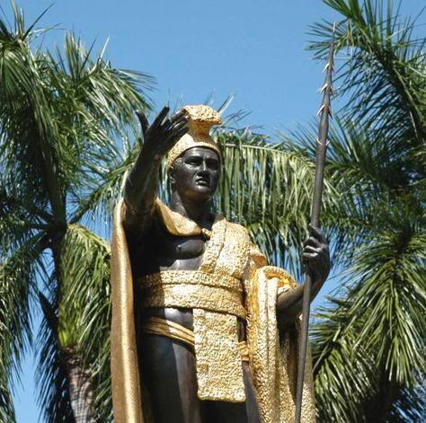
That really didn’t convey the victimhood of the native people, so I looked up more on King Kamehameha. Turns out, there’s a very traditional representation of him, holding a Koa spear in one hand and his other hand reaching out, signifying “aloha,” the catch all Hawaiian word for hello, goodbye, welcome, and love. If you look at it differently, it looks like he’s begging for change… much more appropriate for our idea.
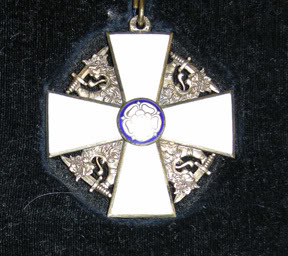
I also looked up more on the band’s name, and the Order of the White Rose is an honor given to Finnish soldiers for some time, including when they were aligned with the Nazis. The Fins kept the medal, unlike the Germans and the Iron Cross. This is totally irrelevant of the notion behind the main design, but I do love my factoids. In any case, the medal made for a nice design to work with.
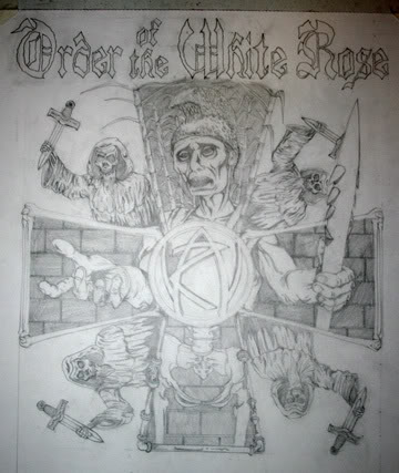
So I drew up the medal design and added in King Kamehameha, rather gaunt and striking the pose of a victim looking for help, as opposed to the bold leader he was. The metaphor is obviously for the Hawaiian people in general.
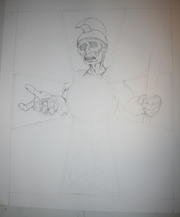
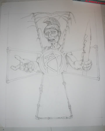
The borders of the cross became bones, because bones are cool, and then water pipes and sugar cane. This goes back to some old article I read about C&H; Sugar Corporation rerouting water from native farmers in order to grow sugar cane. Pure cane sugar is pure exploitation of native people… think about that next time you turn your coffee into a sugar filled milkshake. (Coffee itself is a necessary evil, sorry South America!) In the middle is (Order of the) White Rose’s symbol, created by famous punk artist Winston Smith. I decided to make it more 3-D and like a medallion of sorts.
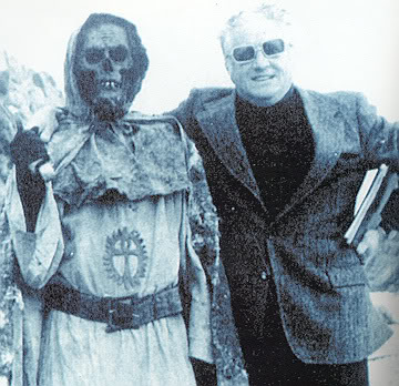
At this point, I wanted to add some really evil missionaries. I used to read a magazine, Tales from the Dark Side, about old ass horror movies. This was the first time I saw the creeps from “Tombs of the Blind Dead.” These Spanish unzombies are supposed to be Knights of the Templar back from the dead, blind, murderous, and they have beards! Skulls heads with beards! I love these guys… I’ve wanted to put ’em in something for a long time.
So, I added the Knights wielding crosses that looked like they were made to kill vampires. The crosses suck, but the missionaries are filling out the layout to look like the old Finnish medal.
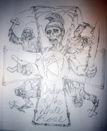
At this point, the band threw in their two-cents and asked if I could move the logo from the bottom of the design. I gotta stop doing that… Jello was pretty bummed when I did that to the Skarp album cover. In any case, they wanted it over a sword, but I was worried about that being too big for the design. I moved the logo up, and did it in faux old English script, so as to keep it within the boundaries. I liked the sword idea though, and I changed the shitty crosses to swords being held like crosses. Seemed appropriately menacing enough. With the logo moved, I had an empty space on the bottom, and I decided to draw out Kamehameha’s waist as skeletonized. Unplanned, but effective looking. The bricks were added for texture and to represent more Western influence.
Finally, I got to the inks. Really, this wasn’t much more than tracing, and adding some dots here and there. It was finished, and (Order of the) White Rose told me they’re quite happy with it. Sweet.

Do you mind if I quote a couple of your posts as long as I provide credit and sources back to your site?
My website is in the exact same niche as yours and my users would certainly benefit from some of the information you present here.
Please let me know if this ok with you. Cheers!
Sure thing… you have my approval to quote my posts. Accreditation is appreciated. Cheers!